

Lawformer - Transcript Management
Dashboard table redesign for Lawformer
Overview
Redesign of the “My Transcripts” page for Lawformer, focused on simplifying transcript management and improving how users rename, download, and delete meeting records.
Problem
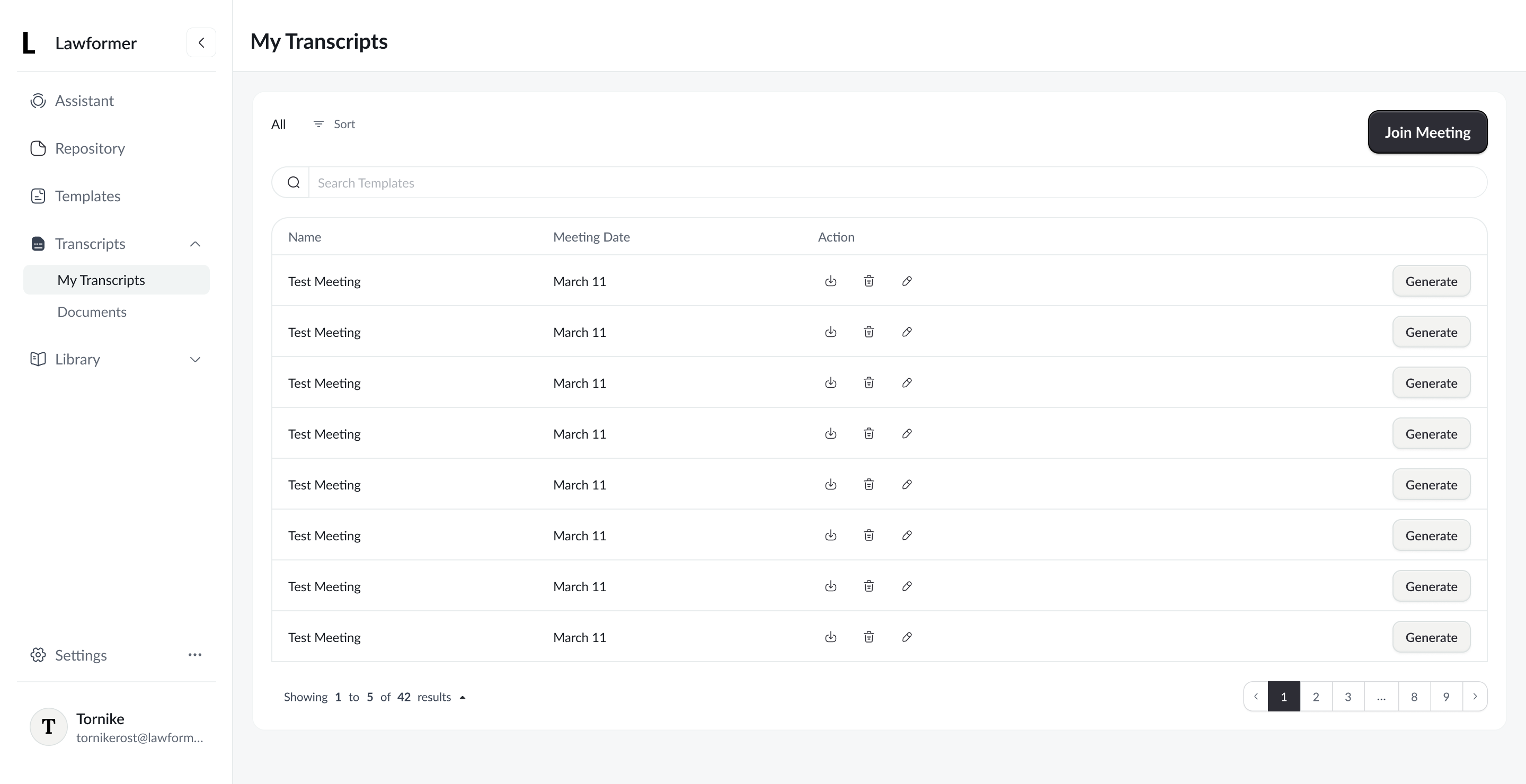
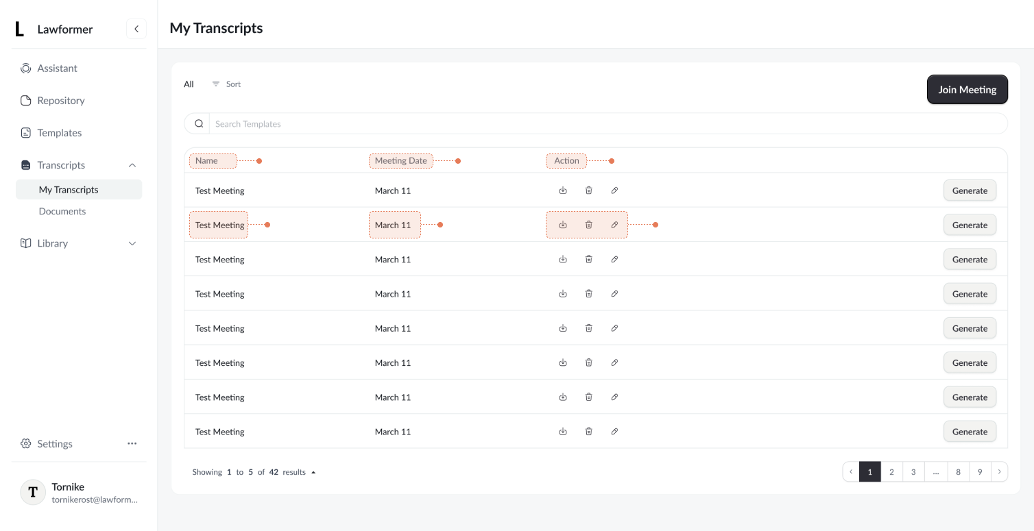
- User actions (rename, delete, download) were hidden behind unlabeled icons in a table, increasing cognitive load. It was very easy to misclick, regarding the fact that small icons such as download and delete were very close side by side. Users needed extra time to, scan horizontally, and avoid accidental destructive actions, slowing down user experience in the transcript management table.
- Additionally, the table-based layout did not align with the intended management experience for transcripts. For this use case, a more distinctive and purpose-driven layout was needed to better support content scanning and action clarity, rather than relying on a traditional table structure.
Goal
Reduces cognitive load, improve action discoverability, eliminate misclick and make transcript management clearer and safer by presenting actions in a more explicit and user-friendly way in order to improve content differentiation
Solution
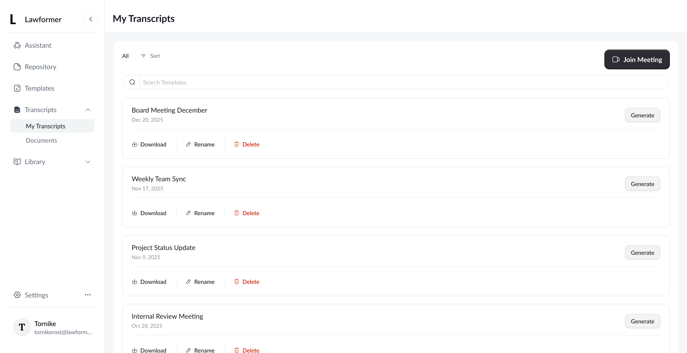
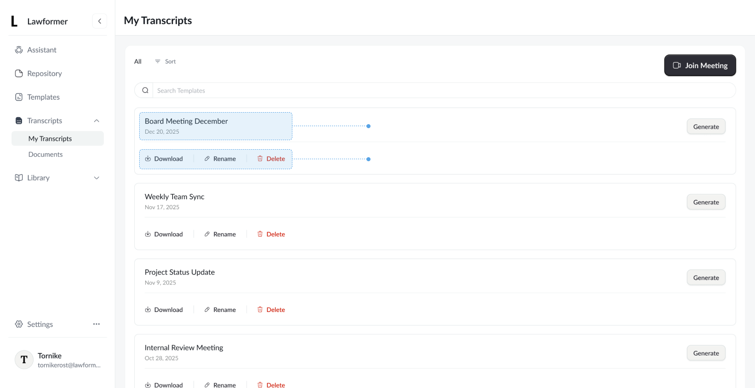
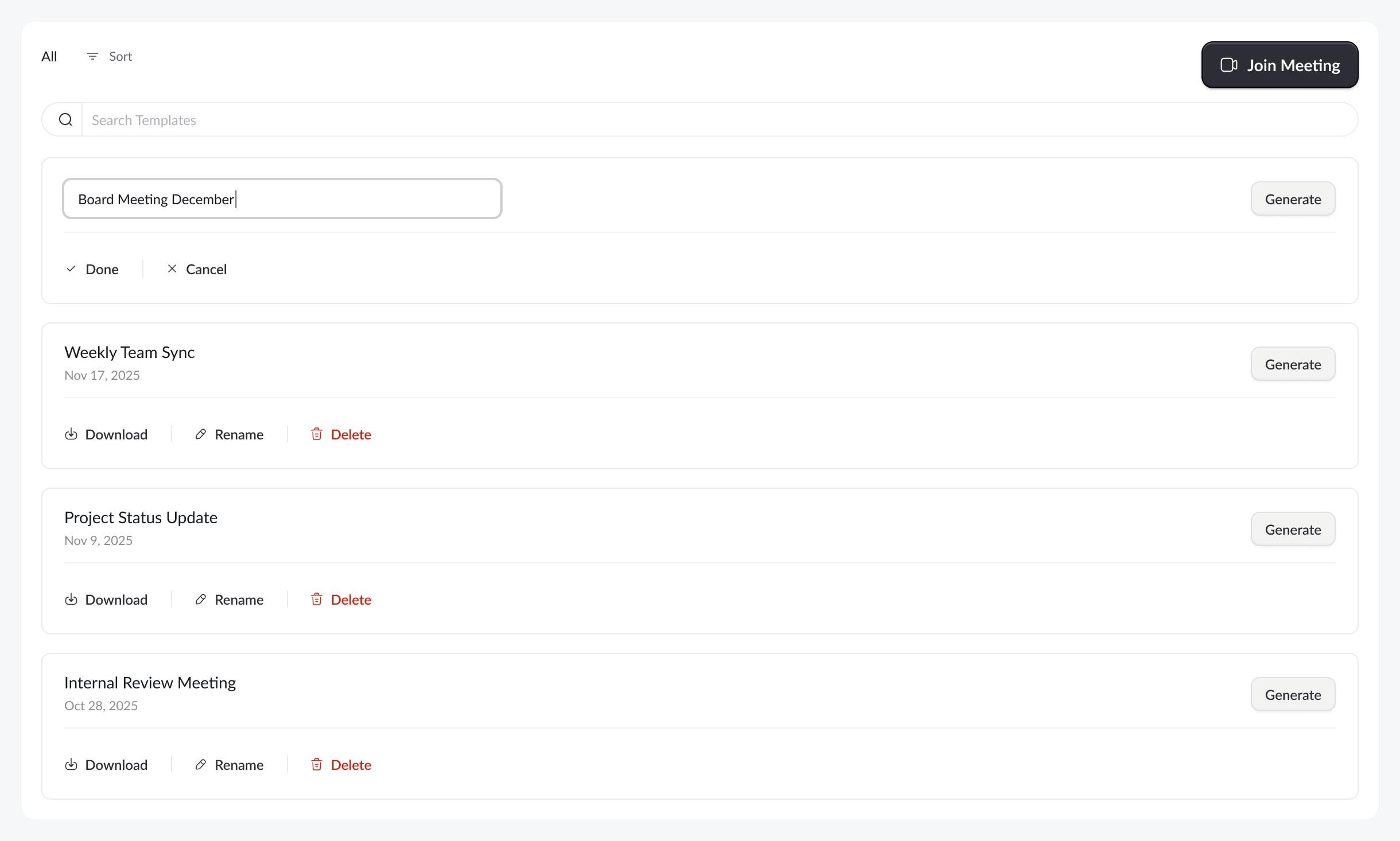
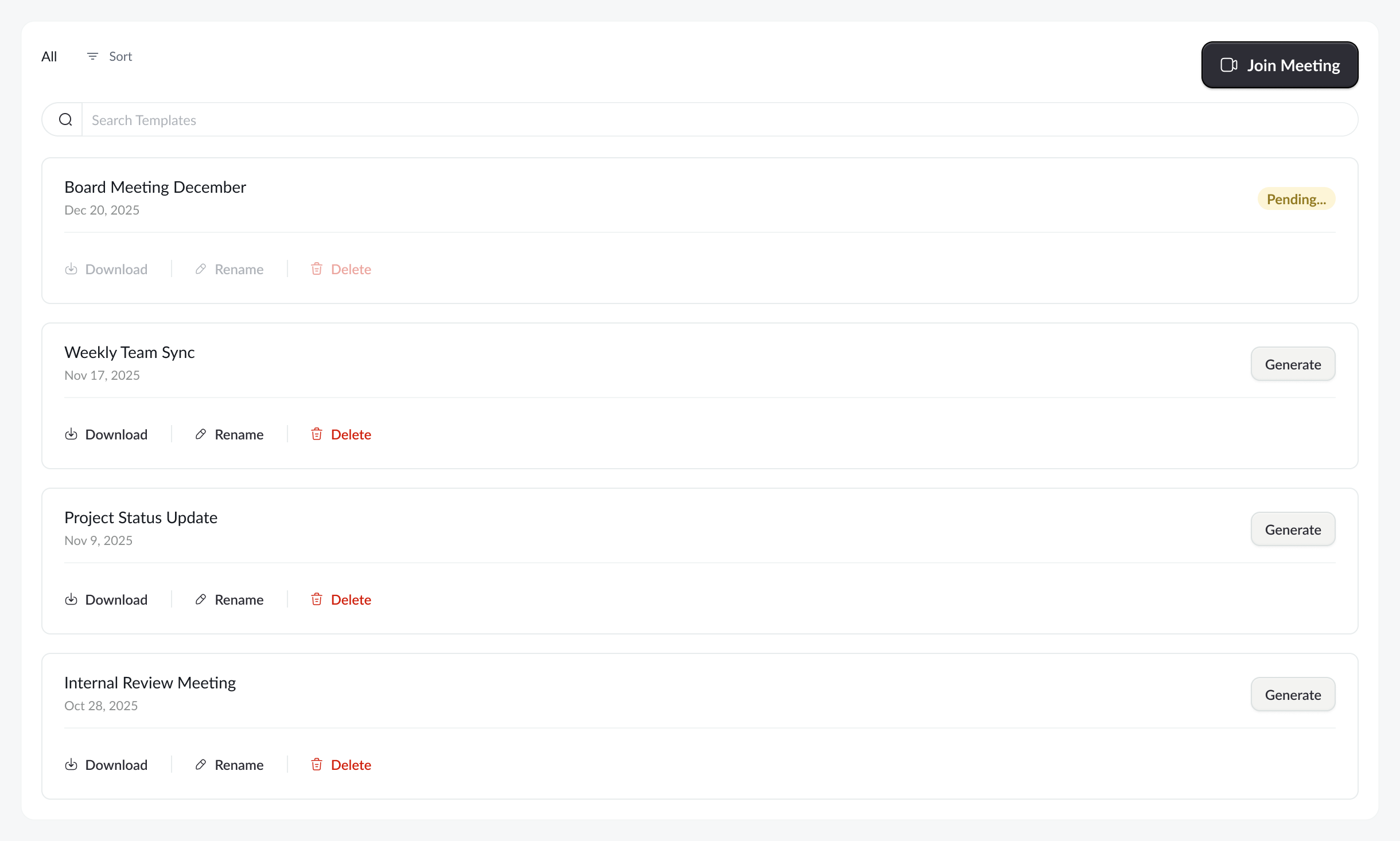
The redesigned layout replaces the dense table with a card based list, grouping related actions directly under each transcript. Actions are now labeled (“Download”, “Rename”, “Delete”), improving clarity and reducing errors. The flow feels more scannable, intentional, and easier to use.
Plus now we have much better consistency in terms of button hierarchy:
- Primary
- Secondary
- Tertiary
Additional Details
Beside the main goals, additional usability improvements were introduced, such as a more streamlined renaming process, reduced emphasis on non-critical data, and clearer representation of pending states.
Tank you for your time

Lawformer - Transcript Management
Dashboard table redesign for Lawformer
Overview
Redesign of the “My Transcripts” page for Lawformer, focused on simplifying transcript management and improving how users rename, download, and delete meeting records.
Problem
- User actions (rename, delete, download) were hidden behind unlabeled icons in a table, increasing cognitive load. It was very easy to misclick, regarding the fact that small icons such as download and delete were very close side by side. Users needed extra time to, scan horizontally, and avoid accidental destructive actions, slowing down user experience in the transcript management table.
- Additionally, the table-based layout did not align with the intended management experience for transcripts. For this use case, a more distinctive and purpose-driven layout was needed to better support content scanning and action clarity, rather than relying on a traditional table structure.
Goal
Reduces cognitive load, improve action discoverability, eliminate misclick and make transcript management clearer and safer by presenting actions in a more explicit and user-friendly way in order to improve content differentiation
Solution
The redesigned layout replaces the dense table with a card based list, grouping related actions directly under each transcript. Actions are now labeled (“Download”, “Rename”, “Delete”), improving clarity and reducing errors. The flow feels more scannable, intentional, and easier to use.
Plus now we have much better consistency in terms of button hierarchy:
- Primary
- Secondary
- Tertiary
Additional Details
Beside the main goals, additional usability improvements were introduced, such as a more streamlined renaming process, reduced emphasis on non-critical data, and clearer representation of pending states.
Tank you for your time